Waitlist Widget Types
If you've visited our demo page, then you'll have noticed that we offer three different types of Waitlist Widget (also known as a Waitlist Form): a large (full) widget, a mini one and a docked widget. This article will cover the major differences and commonalities between these Waitlist Forms.
Why are there different widgets?
At getwaitlist.com, we give you three widgets that you can easily embed into your website using any platform. All waitlist widget types are great for collecting pre-launch signups, but they work/look slightly differently. They're designed to fit different use-cases. We cover them below.
Where can I find the Full, Mini & Docked Widgets?
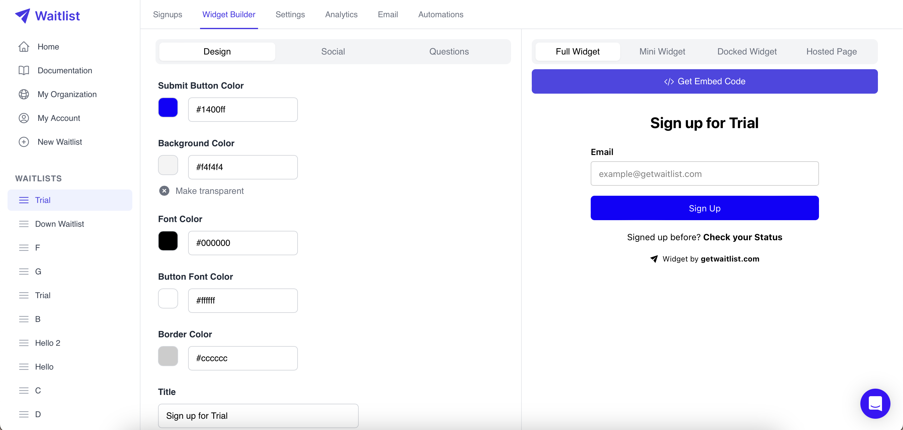
Right in your Waitlist Dashboard! Navigate to a Waitlist of your choice, and then into the Widget Builder. All Waitlists can support all three widgets, and all are available with our plans. In the image below, see the four tabs on the right: Full Widget, Mini Widget, Docked Widget and Hosted Page.

Clicking on "Full Widget" will show you the large waitlist widget and allow you to copy the Embed Code for the large widget. Similarly, clicking on "Mini Widget" and "Docked Widget" will show you the mini waitlist widget, and docked waitlist widget respectively and allow you to copy the respective Embed Code. For copying the embed code, you can also set the widget type directly using the widget embed options.
What does the Full Widget do?
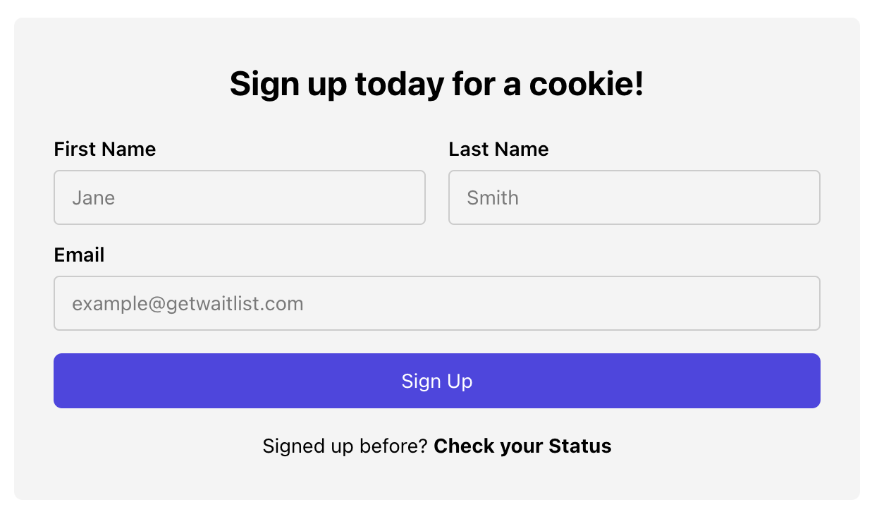
The full widget is our flagship Waitlist Form. It's a true Waitlist form that can be quite large on the page. With the full widget, you can collect all the following information:
- First name
- Last name
- Phone number
- An unlimited number of additional questions. Obviously, the more questions or fields you add to your waitlist form, the longer it will be.

The full waitlist widget also allows the user to see their status in line, and when they sign up, it shows a success screen that can be configured to display many different pieces of information relevant to the signup:
- A success message
- Their position in line
- How many people are on the waitlist
- Their unique referral link
- Various social media links with pre-configured messages that the signed-up user can use to share their referral link
Furthermore, the full widget is embedded in what we call the hosted page, where additionally a logo can be visible on top.
The value proposition of the full waitlist widget is simple: it contains everything you or the user might need to sign up, submit relevant information, and refer their friends. What's nice about it is that it gives you the opportunity to display and customize a lot of text: custom titles and messages depending on whether the user is signing up or has just signed up.
What does the Mini Widget do?
The mini widget is a more recent addition. It's designed as an inline Waitlist that isn't as big or distracting on the page as the full Waitlist Widget. With the mini widget, you can collect only one piece of information: the email address of the user. It doesn't allow you to collect any additional questions, and will throw errors if you've configured your Waitlist to require additional information.

On signup, the mini widget also allows the user to check their status in line. On signup it will show them their position on the waitlist, and how many people are on the waitlist, unless you've turned that off in the settings, just like for the full waitlist widget.
What does the Docked Widget do?
The Docked Widget presents an alternative design option to the Mini Widget. Like its counterpart, the Docked Widget is crafted as an inline Waitlist, focusing solely on collecting one vital piece of information: the user's email address. What sets it apart is its innovative approach—the SignUp Button is seamlessly integrated within the Email Address field, offering a refined and intuitive user experience.

Comparing the Full vs Mini vs Docked Widget
The Large Waitlist Widget excels in detailed data collection and user engagement, allowing for comprehensive information gathering (including names, contacts, and additional questions) and interactive features like status updates and social sharing. However, its size can be quite dominating on a webpage.
In contrast, the Mini Widget's strength lies in its sleek, inline design, making it less intrusive and ideal for sites prioritizing a streamlined user experience. It focuses solely on email capture, offering a simpler, more subtle solution at the cost of limited data collection and user interaction.
Introducing the Docked Widget, a fusion of the Mini Widget's sleek simplicity with a distinctively innovative design. With the Signup Button elegantly nestled within the email address field, this widget not only maintains a streamlined user experience but also presents an additional and refined design choice for your interface.
Data Analytics
Both the full and mini widgets run analytics behind the scenes, sending data back to Waitlist whenever the widgets are displayed to a user. In both cases, the analytics capture the time and date when the widget was shown, the device type it was shown on (e.g. Android vs. iOS), and the full location (i.e. the URL including any URL parameters like UTM tags). So both widgets perform just great for purposes of you gathering metadata data on the users signing up.